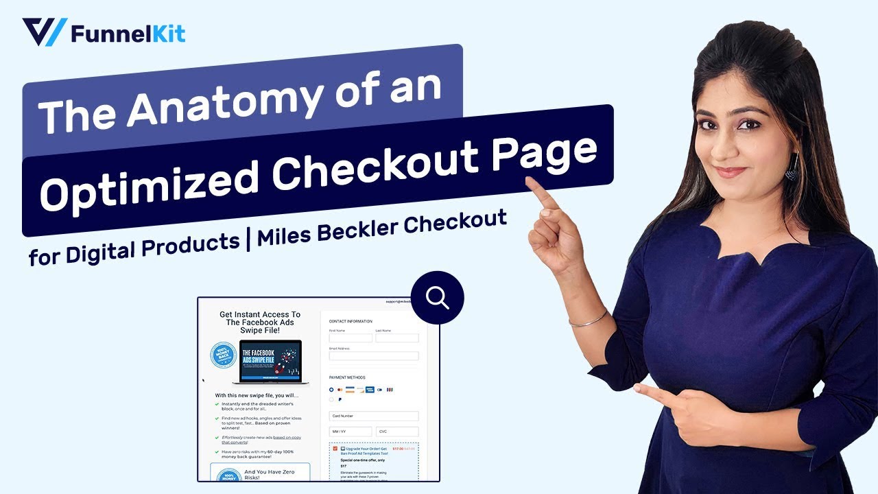
Do you want to create an optimized checkout page for your digital products to maximize conversions?
Let’s not forget that cart abandonment is a big issue for a majority of digital product sellers.
As per research by Statista, 8 out of 10 people tend to abandon their carts and don’t complete the purchase.
For digital product sellers, it’s quite frustrating.
Therefore, it’s important to have an optimized checkout page on your store.
In this post, we will look at the Digital Marketer, Miles Beckler’s checkout page for one of his courses and provide you with 8 elements to create a highly optimized checkout page.
Let’s get started.
Contents
Research stats from Baymard Institute show that 28% of online shoppers abandon the checkout page because of the long or complicated checkout process.
An average US checkout page has 14+ form fields where the users have to fill in their details.
By the time, they reach to 10th field, they’re already second-guessing their purchase decision!
This is why we have to keep the checkout process short and simple.
However, the number of form fields is not the only reason for cart abandonment!
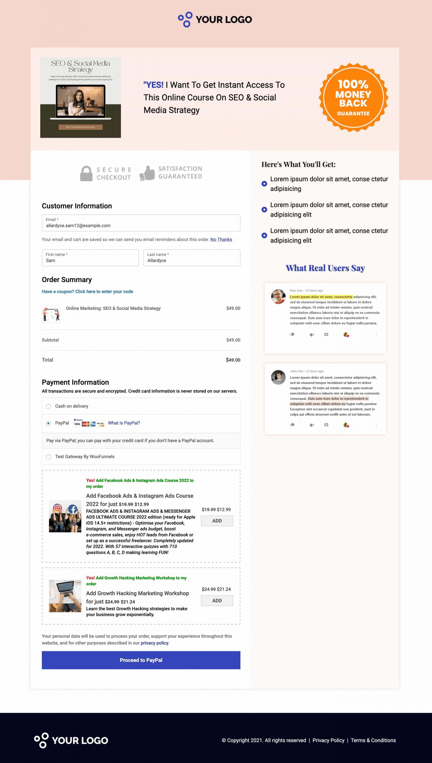
For instance, let’s look at this native Checkout page on WooCommerce:
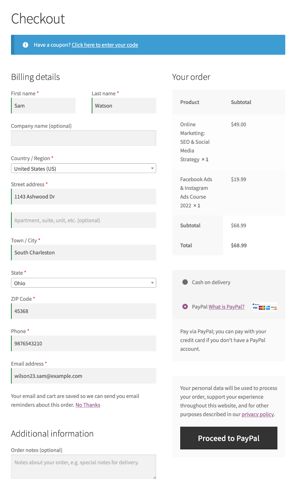
Here are the reasons why this checkout page is not a high-converting one:
These reasons add to the user's concern over their purchase.
Therefore, it’s crucial that you keep the purchase process simple - An optimized checkout page can address last-minute doubts and may not lead to shopping cart abandonment.
In the next section, we will be discussing the components of the optimized checkout page.
For the past few weeks, we studied a lot of checkout pages to analyze the strong and weak points of different websites.
Eventually, we came across a checkout page by Miles Beckler.
As most of us know, Miles Beckler helps entrepreneurs to grow their businesses through efficient sales funnels and strategic marketing ideas.
He also has a successful YouTube channel with 195K+ subscribers where he teaches people how to launch and sell their online courses.
In this section, we will take a look at his checkout page for one of his digital products.
We will also highlight all the important elements that you can implement and create your own optimized checkout page.
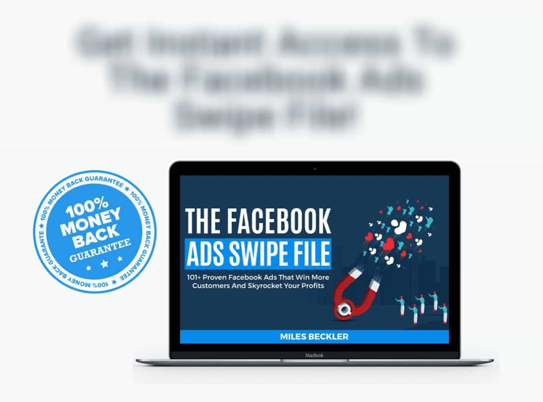
Having a clear heading for your product-specific checkout page reminds people of what they are about to buy.
It helps carry the conversation forward from the sales page onto the checkout page.
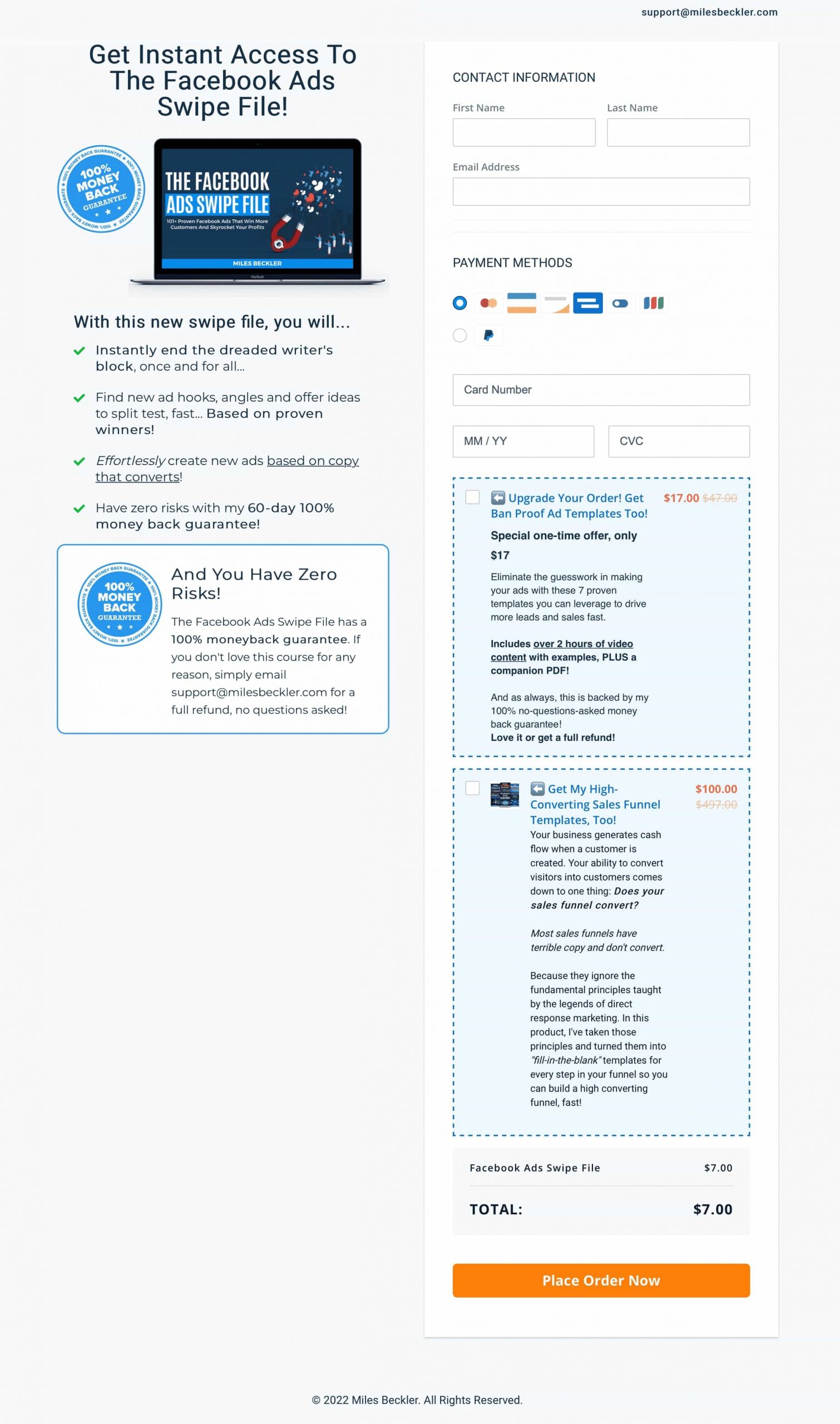
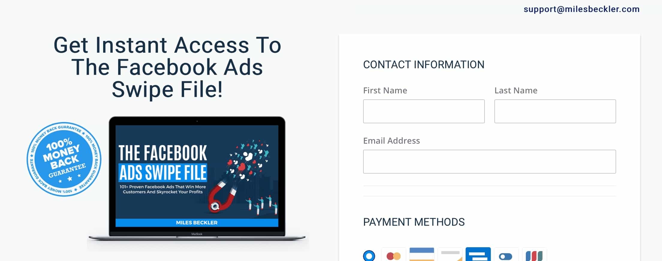
For example, the headline here says - Get Instant Access to the Facebook Ads Swipe File!

The title or the heading of the checkout page helps avoid any confusion.
The prospects should instantly know what product they will get when they hit the checkout button.
Removing unnecessary distractions on your checkout process would help maximize conversions.
When you don’t have clickable headers at the top, users can either complete the purchase or exit the browser window completely.
As you can see, the following checkout page has:
It’s serving the exact purpose of enhancing conversions.
You can encourage your prospects to make a purchase with a focussed checkout page without any distractions.
Humans process visuals 60000 times faster than plain text.
Adding product images help form the connection better between the sales page and checkout page.
Having an image of the product as a part of your optimized checkout page assures them that they are getting the right product.
This is the exact technique that Miles Beckler implemented on his checkout page:
Making the checkout process simple and fast will always get the best results.
Remember, a better user experience is the key to reducing abandoned carts.
It’s important to customize the form fields on the checkout page as per your businesses’ requirements.
At the same time, you must keep the fields limited.
You don’t want to scare your users away with a complicated or lengthy checkout process.
As per the research by Baymard Institute, checkout forms with 6 to 8 fields show a significant improvement in cutting down cart abandonment rates.
Since this checkout page is optimized for digital products, they haven’t asked for more information on the form than they need.
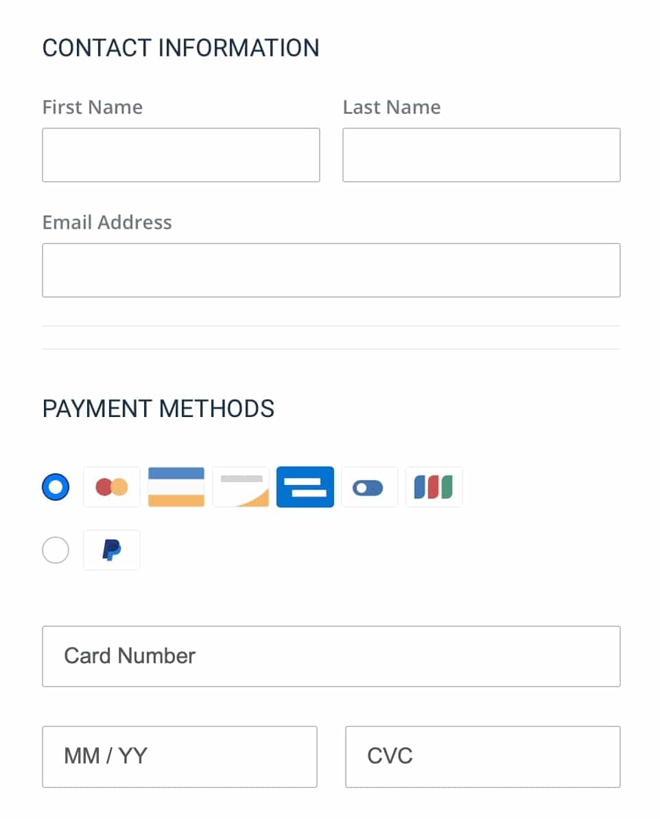
As you can see, they have eliminated the billing and shipping-related fields because they do not need them. Hence, making the form look consumable and easy to fill out.
The minimal number of fields makes it easier for easy checkout and thus helps maximize conversions.
The goal of an optimized checkout page is to convert prospects who have landed on it.
After getting to the checkout page, users might be inclined to question their purchase.
This is why it’s best to reinforce the benefits of your product on the checkout page again.
You may already have stated these points on your sales page; but since the sales page is quite lengthy, users may misread them.
Take a look at the benefits section on this Checkout page:
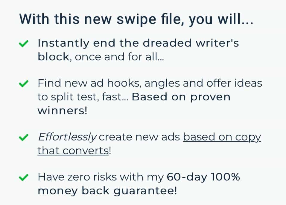
As you can notice, the bullet points are short, crisp, and state the key benefits of the product.
Not only does it remind them of what they are about to sign up for, but also it persuades them to take the final action.
Credibility and trust come when you serve in others’ interests.
As per the research by Invesp, 67% of online shoppers check the refund policy before making a purchase.
Therefore, it’s essential to assure your prospects that they aren’t risking their money by buying a product from you.
For this reason, you should have a refund policy when creating an optimized checkout page.
When users see some trust signals or there is a credible refund process in place, they feel confident about buying.
Miles Beckler has provided a visual badge that says the product comes with a 100% money-back guarantee.
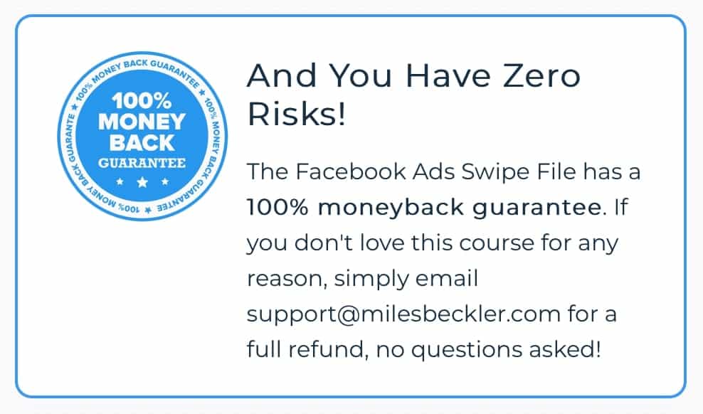
The badge is easy to locate and helps build the reassurance that they will get their money back in case they do not like the program.
Amazon generates more than 35% of its revenue through upsells, cross-sells, and order bumps.
Order bump offers are easy to set up and collect more revenue than you think.
You can optimize your checkout page with multiple offers to help increase conversions and thus the average order value.
Barry Schwartz in his book, The Paradox of Choice: Why More is Less, has explained the psychology behind offering multiple choices.
By optimizing multiple order bumps on your checkout page, you are doing two things:
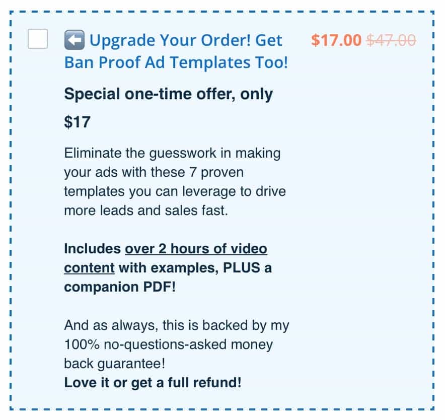
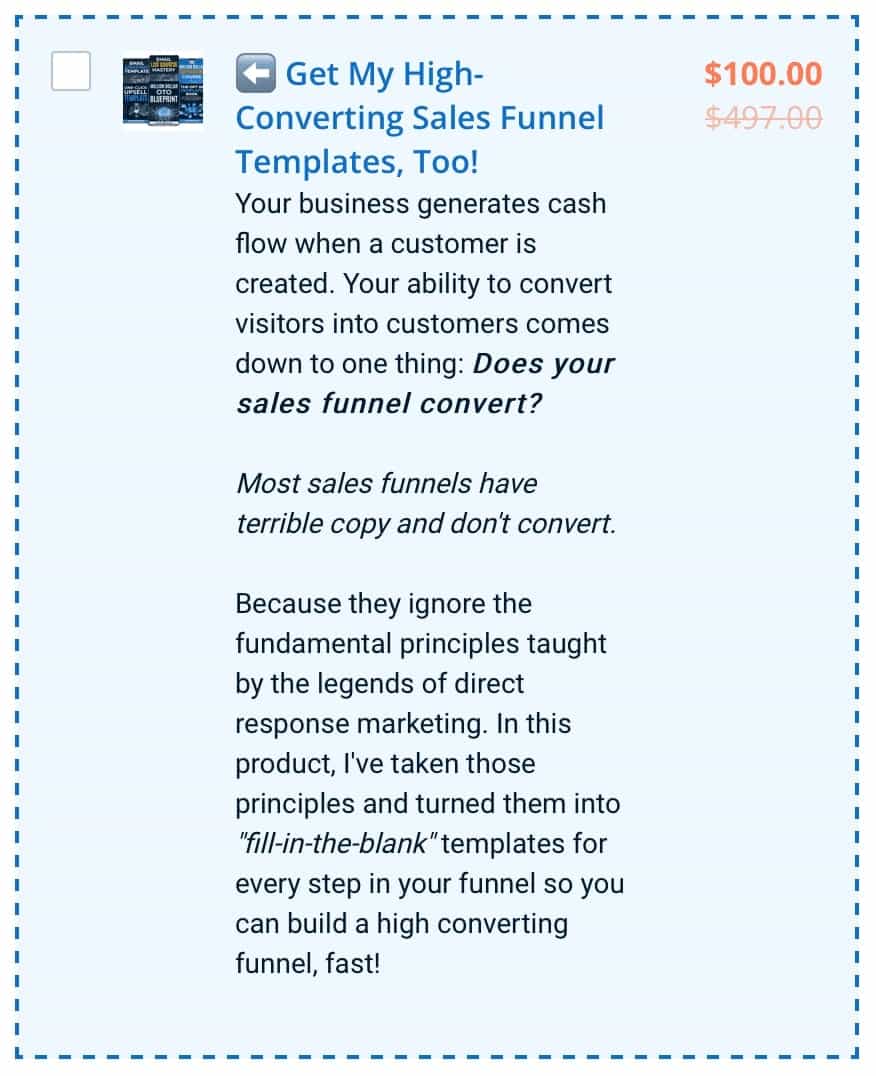
For instance, Miles Beckler has provided two order bumps for his core product. He has provided these choices to users so that they can select the one they like.
Let’s break down the two offers.
The first offer is a $17 (low-priced product) that has a suitable title, content (of what’s inside the product), price, proposition value, and money-back guarantee.
The other offer is a $100 product. It’s a bit long because it addresses the problem aggravation with the higher-priced offer.
Users feel empowered in having a number of choices and selecting one they like.
The Checkout page is the best place to cross-sell your products because you know exactly what they’re about to buy.
That’s why marketers love optimizing the order bumps on their checkout page.
But what makes the perfect order bump?
It should be an offer that adds value to the core product that your prospects are about to buy.
As you already know what they’re about to purchase from you, it’s easy to create catchy content for your offer.
Miles Beckler has optimized two order bumps on his checkout page.
As you can notice, both the offers follow a similar template:
All of this combined makes a really compelling order bump copy.
By providing these bump offers, you are also giving them exposure to more products in your store.
In the next section, we will briefly tell you about the FunnelKit (formerly WooFunnels) Funnel Builder - the plugin where you can implement these optimization strategies.
We at FunnelKit offer you some amazing templates to create your sales funnels.
You can create your Opt-in page, Opt-in confirmation, Sales page, Checkout page, Order bump, One-click Upsell, and Thank you pages.
Your checkout page should give a vibe of trust and confidence.
With such unique templates at your disposal, we can’t think of a better plugin to create optimized checkout pages other than FunnelKit.
You can put your unique headline, reinforce the value proposition and deploy all the elements that we discussed in this post on your checkout page.
This checkout page template from FunnelKit has all the elements you need to maximize your conversions such as:
If you want to create such an optimized checkout page, then head over to FunnelKit right now.
The checkout process is undoubtedly the most crucial cogwheel in the buying process. So, it needs continuous improvement and optimization.
Having basic form fields, keeping product images and providing no exit routes on your checkout page will surely help maximize your conversions.
Certainly, the default WooCommerce checkout page is not enough; therefore, you need something extra to close more sales.
With the Funnel Builder by FunnelKit (formerly WooFunnels), you can easily create your sales funnels with brilliant optimized checkout page templates that are designed to convert.
Plus, you can test different pages of your funnel and find what works for you.
If you want to know more about checkout optimization strategies, here's our post on 21 WooCommerce Checkout Page Optimization Hacks to Minimize Abandonment.
Explore more about the Funnel Builder here.