![How To Set Up WooCommerce One Page Checkout [Updated Guide 2024]](https://funnelkit.com/wp-content/uploads/2022/05/woocommerce-one-page-checkout-funnelkit.jpg)
Do you want to use WooCommerce one page checkouts in your online store?
The single biggest sales driver is the ease with which people can gather all the details about a product and buy quickly.
Otherwise, shoppers tend to abandon their carts if they cannot easily purchase their products.
In fact, 7 out of 10 online shoppers leave the website without purchasing anything in their shopping carts. Of them, 18% abandon the store because of a too long or complicated checkout process. [Source: Baymard Institute]
That’s where WooCommerce one page checkouts work well!
Our user, Jake McCluskey, saw a 57% conversion jump when he replaced his conventional checkout flow with the one-page checkout.
In this post, we’ll walk you through the step-by-step guide to set up your WooCommerce one page checkout and give you tips to enhance your store’s conversions.
Learn how you can customize your WooCommerce checkout page - find out 20 proven tips to set up a high-converting checkout page in your store.
![How To Set Up WooCommerce One Page Checkout [Updated Guide 2024]](https://img.youtube.com/vi/brVUsOAblKw/maxresdefault.jpg)
If you want to enhance conversions in your store, we have something special in store for you. Click on the button below to get started.
Contents
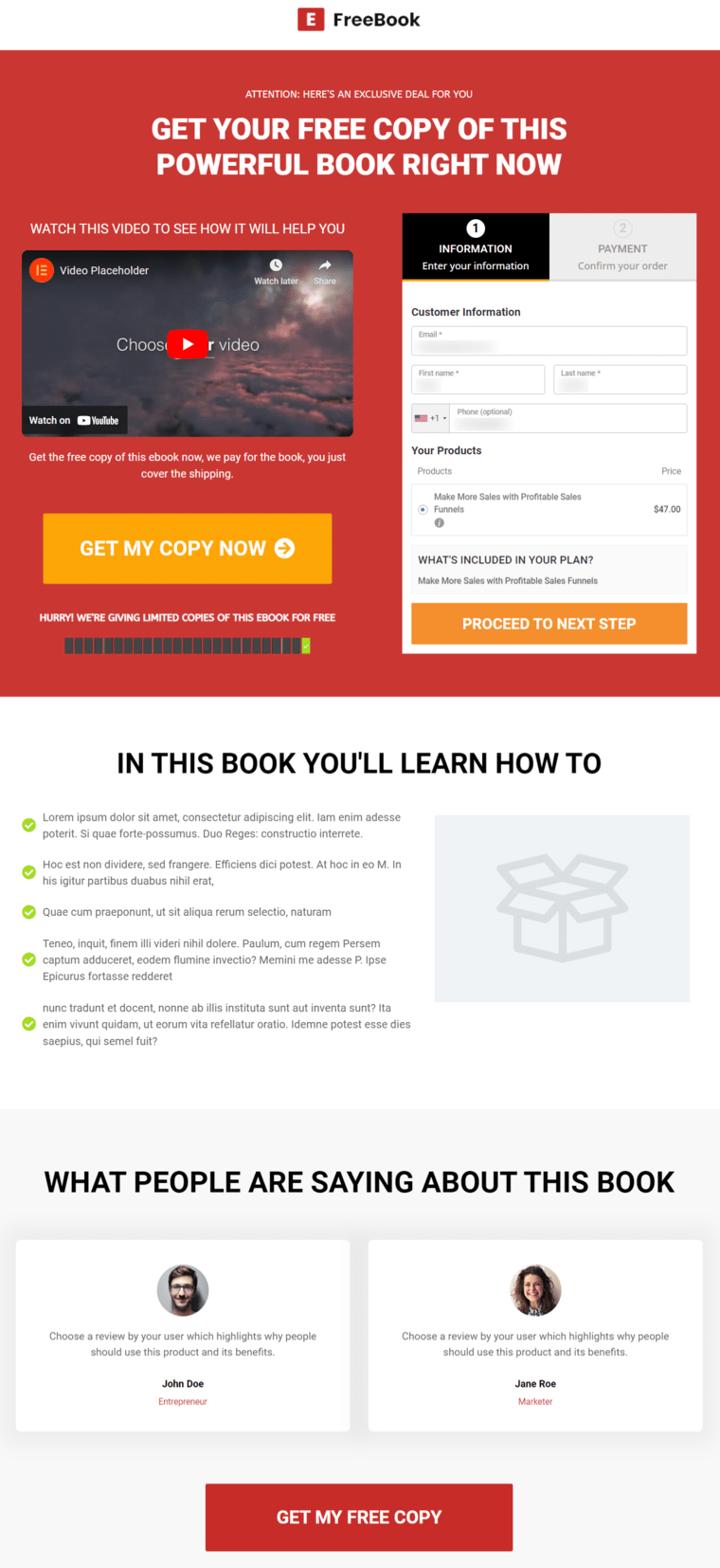
A WooCommerce one page checkout is a sales product-cum checkout page that allows you to display product selection and checkout forms on a single page.
Here, the user can explore the product in great detail and purchase it from the same page on your WordPress site.
A single-page checkout offers a simple product selection and checkout process that helps fit everything on one screen and requires less time to complete the purchase.
Here’s a WooCommerce one page checkout example:

Instead of putting hoops to jump through in your shoppers' way, you can direct them to a dedicated one-page checkout and confidently close the sale.
One-page checkout is excellent for selling specific products that require the distraction-free buying environment a single page offers.
It further helps to reduce cart abandonment scenarios.
You can direct traffic from your email list, Facebook ads, and Instagram ads to your single-page WooCommerce product. This would become a high-converting sales funnel for that product.
In a typical retail store in the offline world, a shopper first chooses what to buy and then adds it to their cart. They then go to the checkout counter, where they often wait for their turn.
That’s precisely how we treat users in the online world as well.
If we look at the default WooCommerce process, shoppers start their journey on the product page, add items to their carts, move to the cart page and head to checkout.
As you can imagine, there are 3 or 4 steps in this long-drawn process, and drop-offs happen at every step because of a poor shopping experience.
There is a vast difference between the number of people who started the journey on the product page and those who actually finish it on the thank you page.
And many end with cart abandonment.
Plus, the default WooCommerce checkout page isn’t fit to convert shoppers into becoming paying customers.
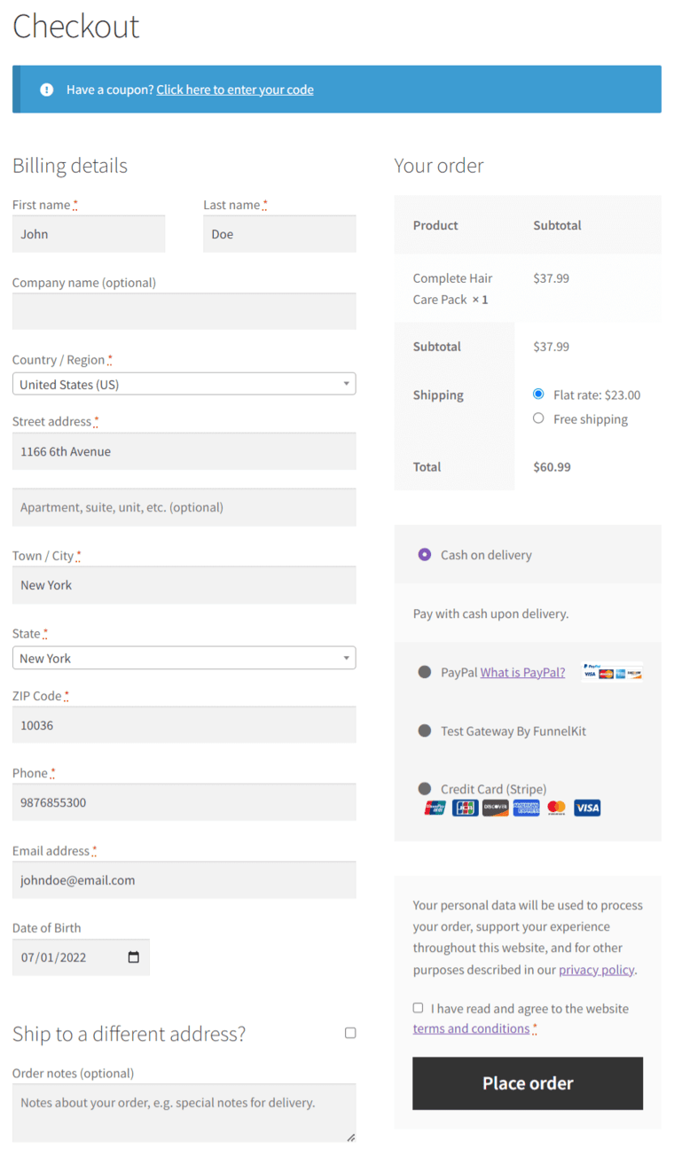
As you can see, the default checkout page in WooCommerce looks too long and quite dull.
But with a custom WooCommerce one page checkout, you can serve your shoppers well and encourage them to purchase their products.
One-page checkouts help you offer faster checkout and potentially replace your cart page!
Let’s examine why a one-page checkout will increase conversion rates at a higher-order value for your business.
1. Quick and easy purchase process
All the information related to the product, including user testimonials, videos, and even the checkout fields, are displayed on your landing pages.
The user can explore the product extensively on this page, and then when they’re ready, they can fill out their details to buy.
2. Better display of checkout add-ons and relevant offers
By displaying relevant checkout add-ons as product recommendations and attractive offers, you can encourage shoppers’ impulse to purchase.
These offers can be - Buy 1 at a flat discount, Buy 2 Get 1 free, or Buy 3 Get 2 free.
Pick from one-shot payments or longer, easier payment plans without going to a shopping cart or shop page. All of the checkout fields will be on the landing pages.
This makes people feel in control of their decision and all you have to do is use an add-on for your WooCommerce store.
3. Distraction-free process
There are no distractions involved with WooCommerce one page checkout. Shoppers don't see a product archive list, pricing table, cart page, links, or any sort of distractions.
Instead, you can create a strategic sales funnel with order bumps and one-click upsells to maximize your returns on ad spending.
4. Email collection prioritization for abandonment cart recovery
Since you’ll be directing traffic from paid ads, influencers, your email lists, and more such places to this one-page checkout - we're sure it’s important for you to capture more cart and checkout activity.
You can do this by breaking your checkout into a multi-step process and making email the first field before they complete payment in your WooCommerce cart.
5. Mobile-optimized checkout
Over 55% of traffic comes from mobile devices. A one-page checkout can be perfectly optimized for mobile.

The users can explore the product selection or product table on the page, read relevant case studies, watch videos, and when ready, just hit a button to land on the checkout form.
It's even better on a mobile when you don't have to change pages and switch tabs!
In this section, we’ve shortlisted the top 3 best WooCommerce one page checkout plugins.
We have tested a lot of plugins and shortlisted these plugins after months of research. Thus, we can rank them based on the ease of their usage, functionality, and value for money.
Here, we’ll focus on the features, pros and cons of each plugin on this list.
FunnelKit Checkout offers a complete checkout page solution for your WooCommerce store.
It has free and premium templates that let you design beautiful, high-converting store checkouts and individual product-specific checkouts such as shopify checkout, multi-step checkout, and more.
Plus, you can customize your WooCommerce one page checkout templates with any page builder.
FunnelKit deeply integrates with page builders like Elementor, Divi, Oxygen, and Gutenberg. You can design your WordPress sales funnels, including checkout pages, with other page builders using custom shortcodes.
Furthermore, it's the most advanced WooCommerce checkout manager plugin that allows you to modify the fields on your checkout forms and optimize your checkout pages for maximum conversions.
FunnelKit offers its users free (lite) and premium versions.
Pros
Cons
FunnelKit has an excellent one page checkout and layouts for WooCommerce that matches all your use cases.
This plugin from WooCommerce makes it easier for your users to view both product selection and checkout their products on one page.
This way, you have the ability to add or remove products from their cart and complete the payment process without leaving the checkout page.
It has different templates, powerful integrations and shortcodes to design your one page checkout pages.
Plus, you can create multiple landing pages and easily embed the checkout forms on them.
Pros
Cons
This plugin doesn’t provide any free version. Its premium version costs $79 annually.
The Direct Checkout for WooCommerce plugin simplifies your checkout process for high conversions.
The Ajax add to cart functionality lets users add items from the catalog to their carts without having to load the entire page every time.
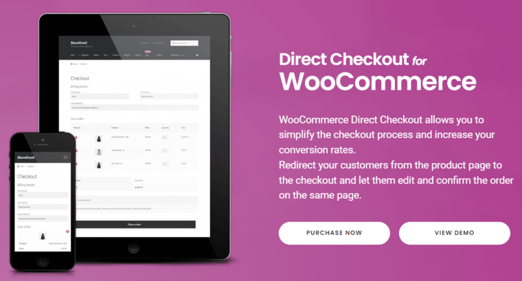
Furthermore, you can easily remove unnecessary fields on your checkout form to speed up the checkout process for higher conversions.
Pros
Cons
Our Opinion
Out of all the best WooCommerce single page checkout plugins, none can match the versatility of the FunnelKit.
You can customize the pre-built checkout templates or create them from scratch using any page builder.
Plus, you get to customize the checkout form fields, optimize your checkout page, A/B test your multiple variants, view detailed analytics, and more.
FunnelKit is indeed the all-in-one complete plugin for your checkout page solution.
This section answers your ‘how do I make one page checkout in WooCommerce?’ query. We'll use the FunnelKit - the best WooCommerce one page checkout plugin in WordPress.
FunnelKit is the ultimate WordPress funnel builder that allows you to create beautifully converting one page checkouts.
Make sure to install and activate FunnelKit on your website.
Let’s look at creating and setting up a WooCommerce one page checkout with the FunnelKit Funnel Builder.
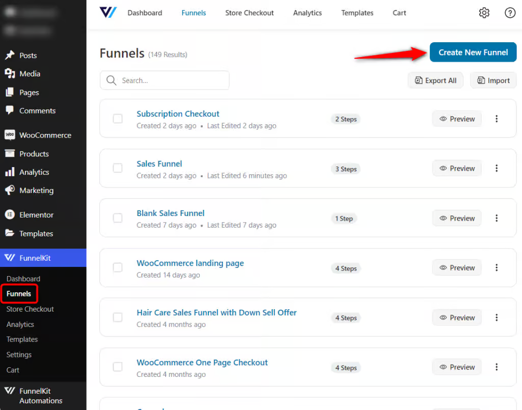
Go to FunnelKit ⇨ Funnels and click on ‘Add New Funnel’.
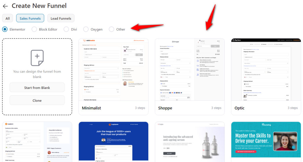
FunnelKit has a wide variety of WooCommerce one page checkout templates to import and customize as per your own branding.
Here, we’ll click on the ‘Start from Blank’ template.
In FunnelKit, there are multiple page builder options you can choose from to create and customize your checkout page:
Next, enter the name of your funnel as WooCommerce One Page Checkout.
You can also choose the steps you want to add to your funnel.
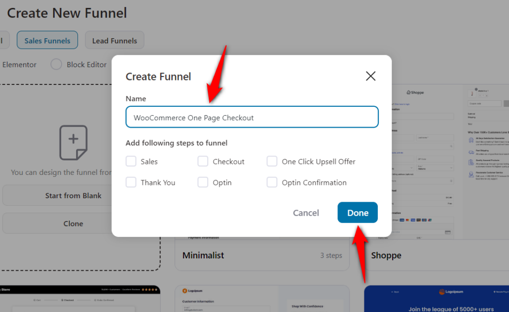
Clicking on ‘Done’ will add a blank sales funnel to your workspace.
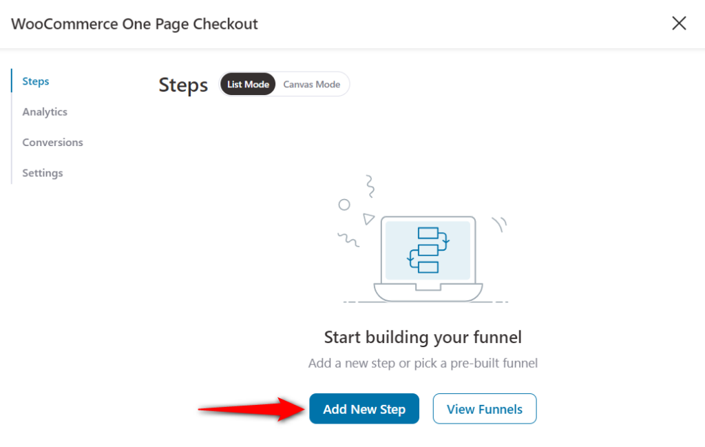
Click on ‘Add New Step’ to add the checkout step to your workspace.
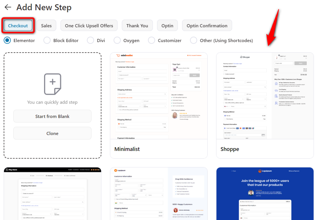
Select the ‘Checkout Pages’ and you’ll see all the checkout page templates.
Here, we’ll select the ‘Closer Template’.
You can see the full preview of the template here.
Choose the number of steps on your checkout page and hit ‘Import This Template’.
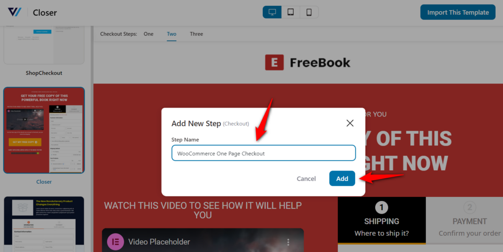
Click on ‘Add’ to import this WooCommerce one page checkout template.
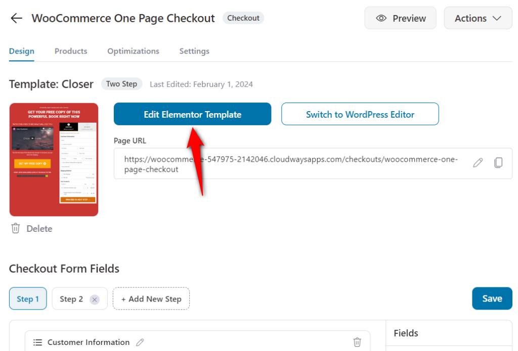
Click on the ‘Edit’ button to start customizing your checkout page.
Now you'll be inside of your checkout page step in your funnel. Explore the various tabs here, such as Design, Products, Fields, Optimizations, and Settings.
Hit the ‘Edit Template’ to make easy customizations without using any WooCommerce one page checkout shortcode or custom coding.
Here, you can change a whole host of things like the brand logo, typography, border-radius, colors, fonts, thickness, and other CSS using Elementor widgets.
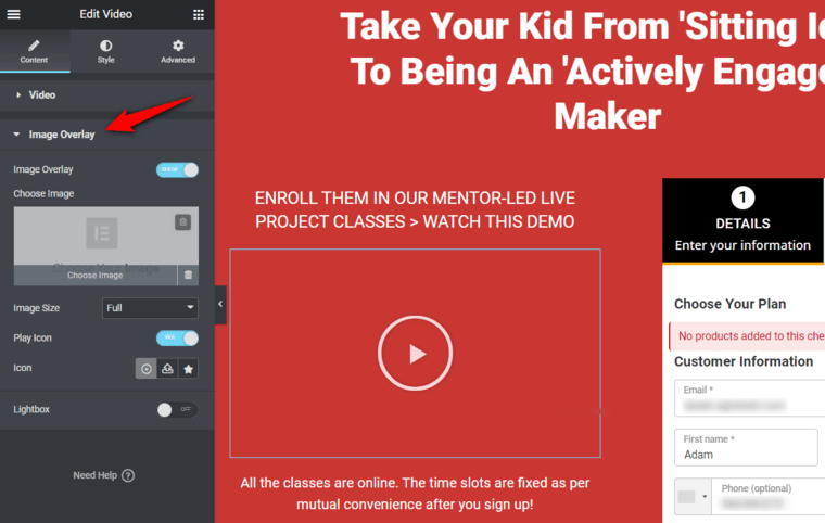
We also recommend that you add a video to your one-page checkout. It'll surely improve the checkout experience and the user will be able to understand better about your product.
Plus, if you want to add an image overlay to your video, click on the video widget and select ‘Image Overlay’.
Activate it, choose an image to overlay, and update it.
Similarly, you can change the heading, background colors, and more to match the overall taste and brand colors.
Next, make customizations to the WooCommerce one page checkout form widget.
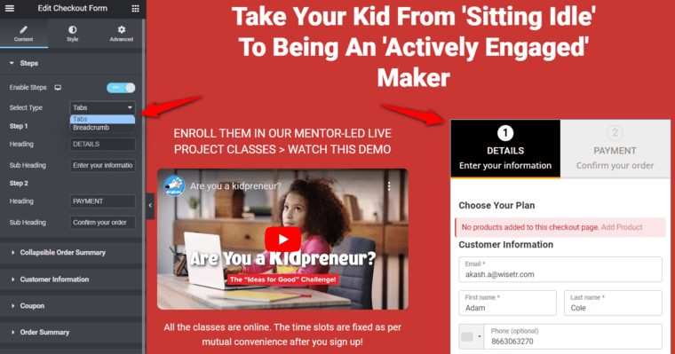
You can also change the button's color on hover and otherwise.
Check out this video tutorial on how to customize your selection and checkout form:
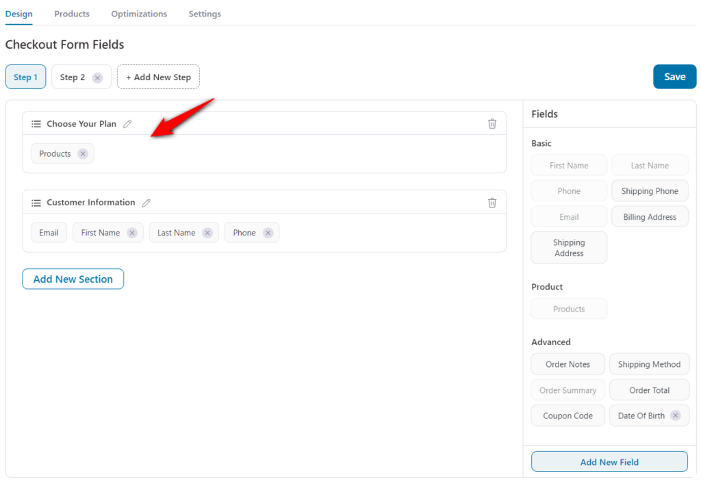
In this section, we’ll use FunnelKit’s extensive form-builder to customize the fields of your checkout form.
You can add, edit, and remove the form fields using FunnelKit’s built-in WooCommerce checkout field editor.
Since we’re selling a digital product, we do not need the shipping address and shipping method-related fields.
Return to the Design tab and scroll down and you'll see the checkout form fields.
So this is what our final form looks like:
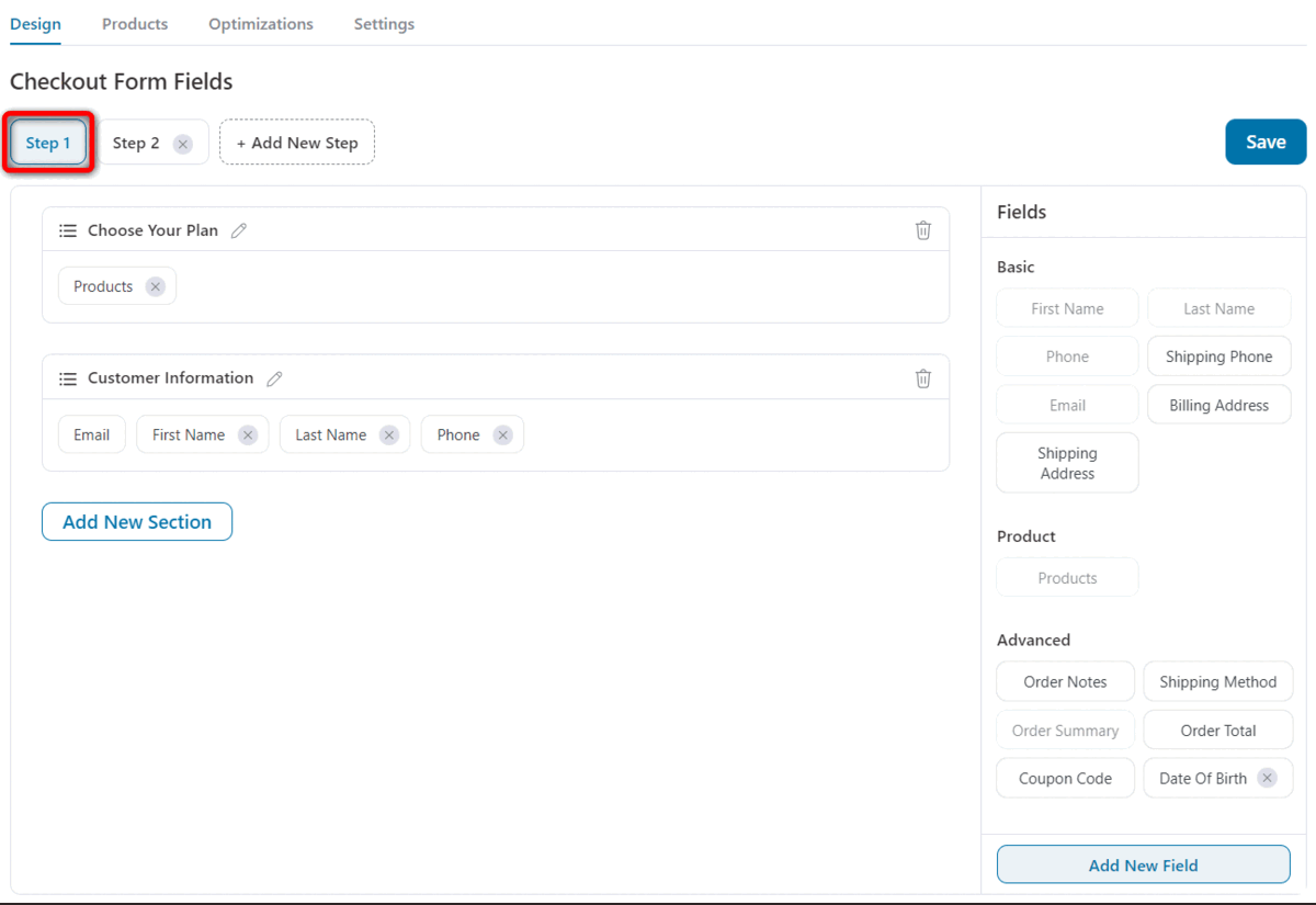
The first step contains the basic information fields, the second step has the Order Summary and payment-related fields.
In the ‘Products’ field, you would want to set an option as pre-selected on default.
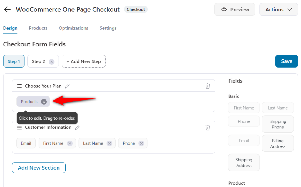
Apart from that, you can also add a ‘Best Value’ tag or any custom tag to highlight the most popular choice of other customers.
The tag could be - ‘Money Saver’, ‘Power Bundle’, ‘Super Saver’, or anything you choose.
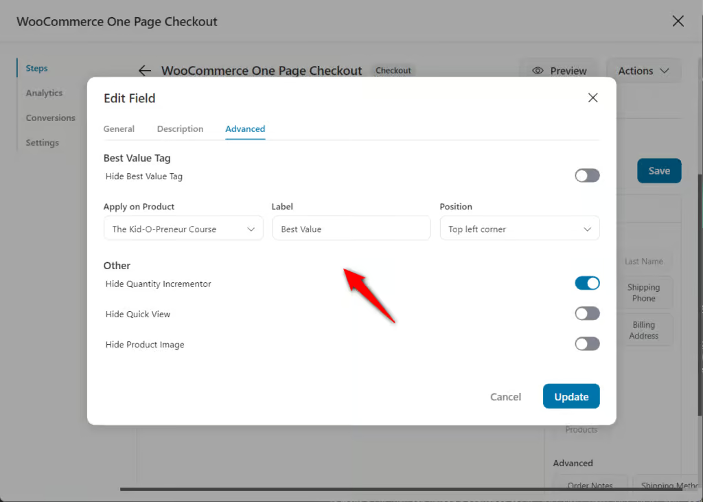
Check out this video to see how easily you can set that up at the backend.
In this section, we’ll look at how to add products to your WooCommerce one-page checkout.
You can add multiple products, configure discounts not available elsewhere on the product page, and even set quantity from here.
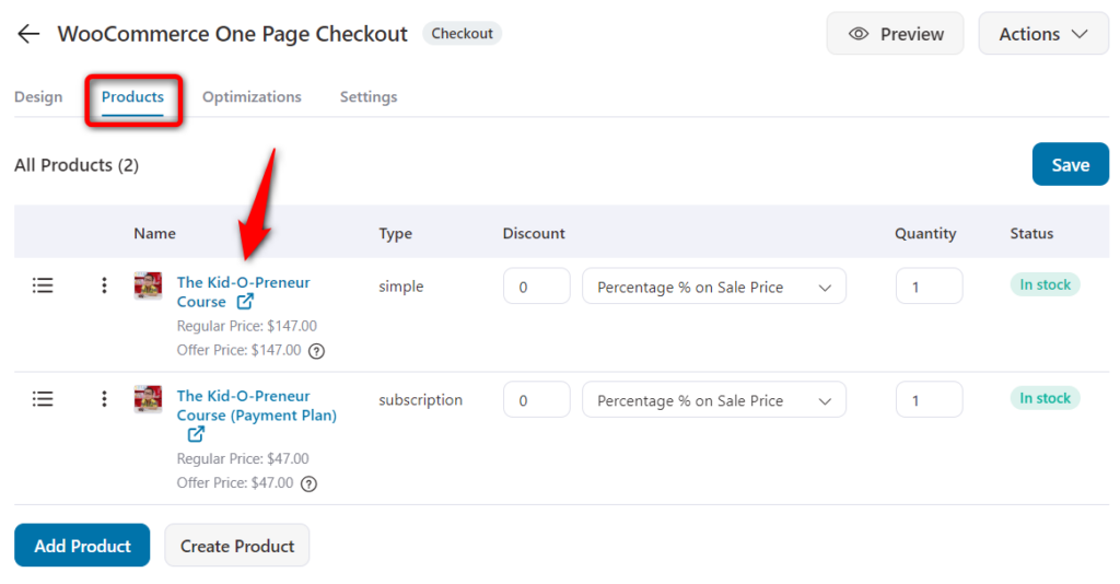
You may choose to sell specific variants of a product.
Finally, you can use drag-and-drop to display the added products in a specific order.
Here, since we’re selling a digital product, the two options we are offering are:
The user can choose one of the two options and they’ll be billed accordingly.
The 3-month payment plan is a WooCommerce Subscriptions product.
Remember that when you’re offering a 3-month payment plan, it should appear slightly less lucrative than a single payment.
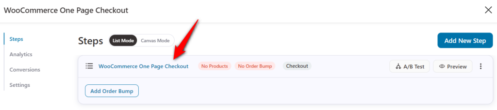
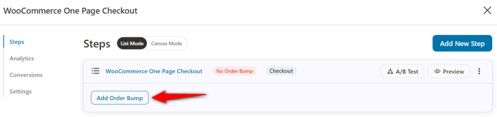
You can add an order bump, i.e., a cross-sell offer, to your WooCommerce one-page checkout.
This allows you to make more dollars per transaction, making your ads profitable. This is how you can do it.
Add the order bump and name it:
After adding and naming the bump, choose the order bump skin you want.
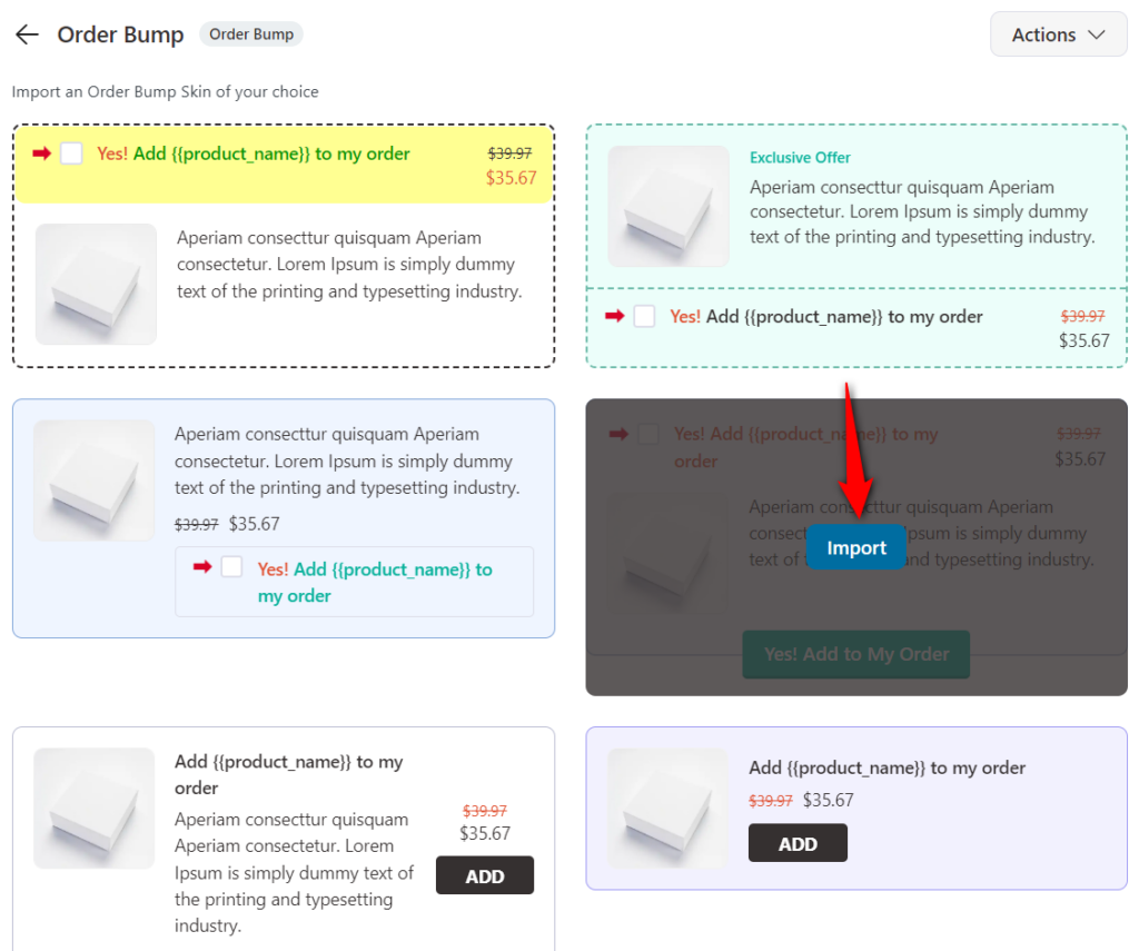
After importing the skin, add a product as your order bump offer.
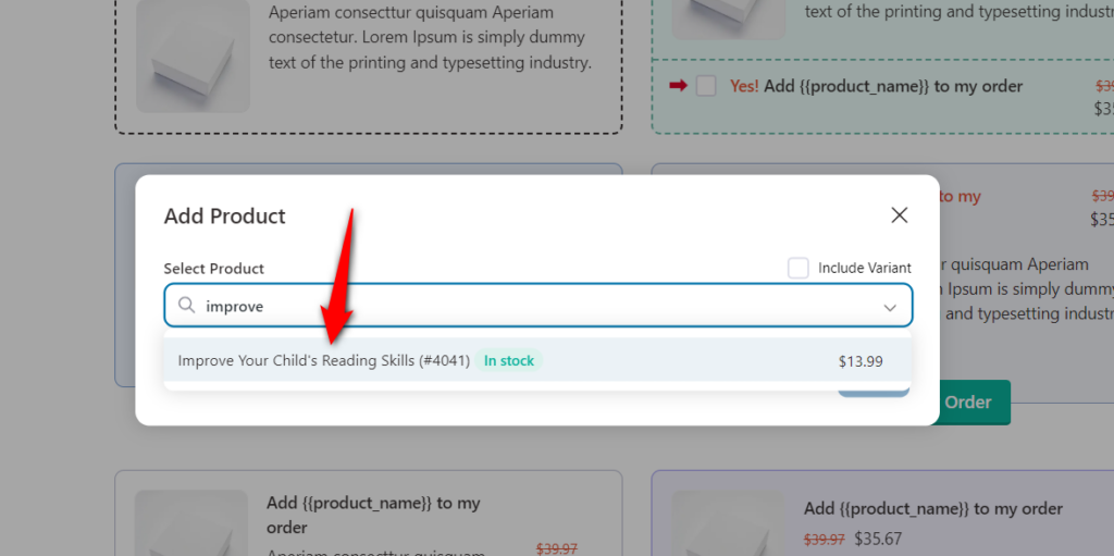
Once your products are added, you can provide them with a discount or configure additional settings from the Products section.
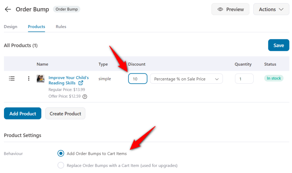
Once done, hit the ‘Save Changes’ button and move on to the next tab.
Customize the look and feel of your bump offer in the ‘Design’ tab.
Also, write a copy of your offer here:
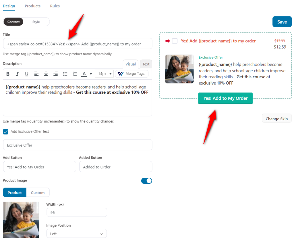
You can also change the color of the title, padding, color of price, description, and more under the Style sub-tab.
There you go! Save your design and go live with your order bump.
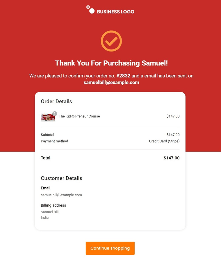
Most marketers don't realize that the thank you pages actually serve as a powerful promotional opportunity.
A thank you page is the last step on your funnel and is the perfect place to show gratitude or add crucial order details.
FunnelKit gives you different templates to set up a perfect custom thank you page for WooCommerce one page checkout page.
Take a look:
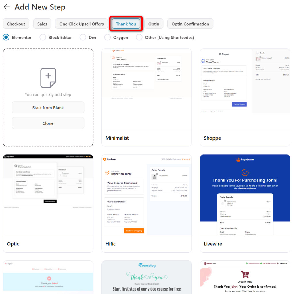
You can easily create and customize your thank you page just like you did with your checkout page above.
When you’re done making the changes to the title, border, typography, etc., hit the ‘Update’ button.
This is what our final thank you page looks:
Join our Facebook group or follow our YouTube channel to learn more about such tips, tricks and optimization strategies.
FunnelKit offers a variety of checkout templates for one page and multi-step checkout pages. You can explore our ever-growing templates for landing pages, lead generation pages, upsells, and more.
Here are some of the best WooCommerce one page checkout templates available in the FunnelKit Funnel Builder:
The closer template works perfectly for single product checkout. It has all the elements, including the product’s details, an embedded product demonstration video, benefits and testimonials.
FunnelKit’s Razor template for WooCommerce one page checkout is a classic. It has a blue header that can be customized per product on the checkout page.
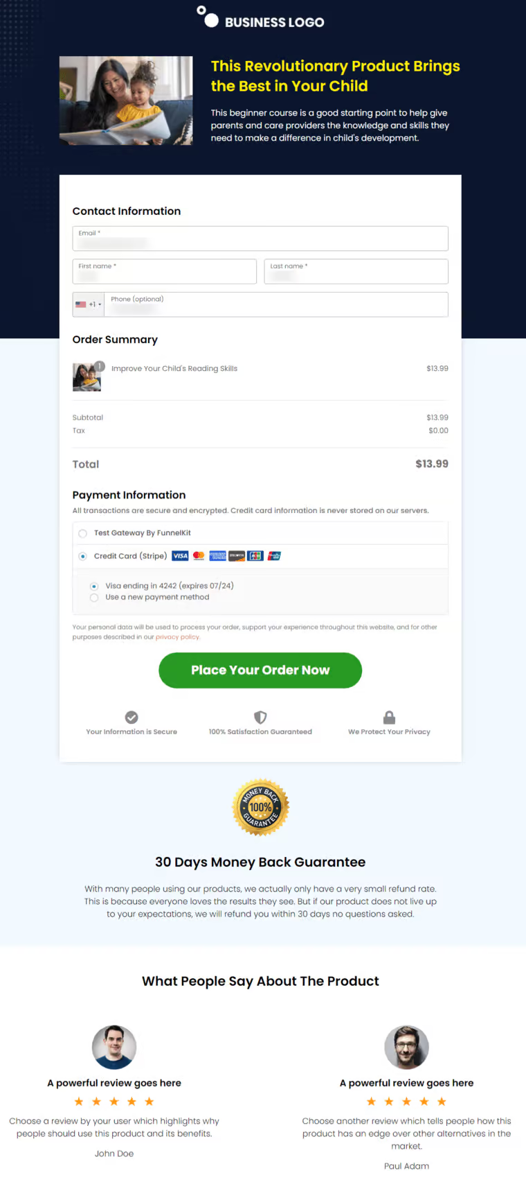
If you scroll down, you’ll see the complete checkout form followed by the user reviews that further reinforce the trust in the product.
The Booster template available in FunnelKit is quite special. It works on the PAS framework by discussing the problem, agitation and providing the solution.
This one page checkout template is quite effective for single products.
The Stunner template has been beautifully designed to showcase your product’s information. It displays its benefits, social proof, checkout form and the product's creator to show their credibility.

These were some of the best WooCommerce one page checkout templates available in FunnelKit. You can even design your own custom templates with the page builder of your choice or import one from your device.
Here, we've answered some common questions asked by users related to WooCommerce one page checkout:
1. How do I create a custom checkout page in WooCommerce?
You can create custom checkout page in WooCommerce with FunnelKit. FunnelKit has different one page checkout templates available that you can use and customize as per your needs.
You don’t need to enable one-page checkouts - all you have to do is import the one page checkout template, customize it and you’re all set!
2. Is one page checkout better?
The usage of one page or multi-step checkout and which is better actually depends on the products you have in your online store. One-step checkout is preferred by digital product sellers and multi-step checkouts are favorites among physical item sellers.
You can always perform A/B Testing in FunnelKit to see which one works best for you.
3. Can I customize the WooCommerce checkout page?
Yes, you can easily customize your default WooCommerce checkout pages and transform them into beautiful, high-converting ones. FunnelKit has beautiful single and multi-step checkout page templates that are highly customizable and optimized for all devices.
4. Can you give me some WooCommerce one page checkout examples?
Here are two examples of single page checkout in WooCommerce:
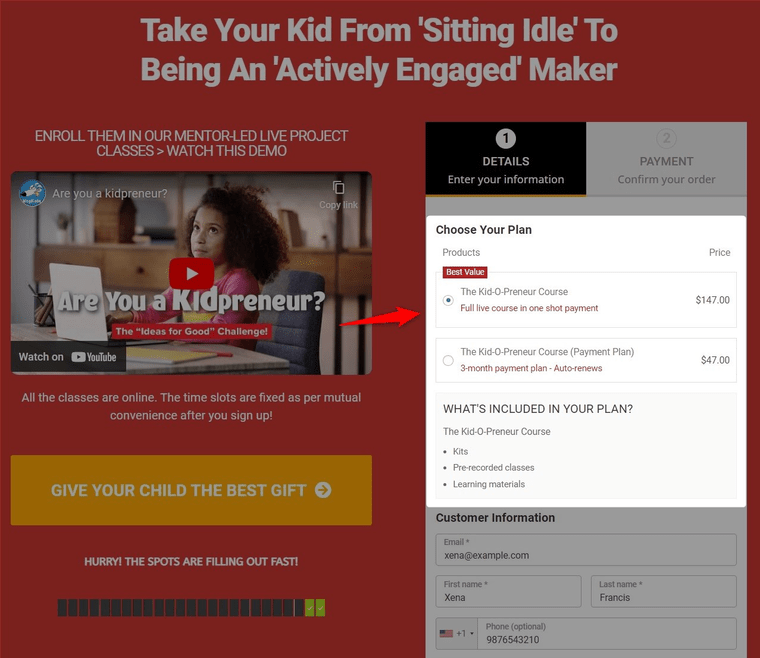
WooCommerce one page checkout example #1: Grant Cardone’s One Page Checkout Form
A one-page checkout helps you get the ROI your business needs to thrive, not just survive.
Take a look at the order form from Grant Cardone:
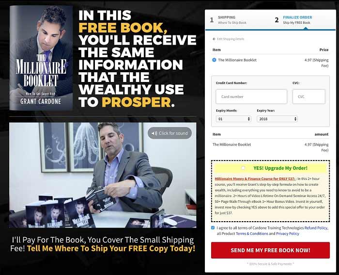
He uses the page to describe the product in great detail and on the right-hand side, the checkout form calls for action. There are no redundant steps in this WooCommerce one page checkout flow; it’s all fast and easy.
Also, there’s an order bump on the second step to increase the order value.
WooCommerce one page checkout example #2: Wardee Harmon’s Single Product Checkout Page
Wardee is the founder of Traditional Cooking School and a pro user of FunnelKit Checkout.
Take a look at her super high-converting checkout page:
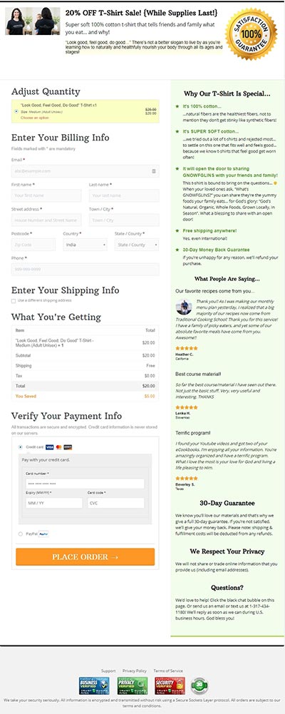
The image showing the product in action is clear & attention-grabbing. The reasons on the right-hand side are value-loaded and help users compare that bib with the others in the market.
5. What is the best WooCommerce one page checkout?
The best WooCommerce one page checkout is the FunnelKit Funnel Builder plugin. It's a complete WooCommerce checkout solution that allows customizations and optimizations for shoppers to buy their products with a single click. Read all about it in this post.
One page checkout cannot be used for every product in your store.
You must select one product to start with or a new trending item. Then, pick your favorite FunnelKit Checkout template and customize it.
Change the colors, typography, and more as per your brand's needs. Write some persuasive copy to convert.
There you go! Now, you're all set to direct traffic from Facebook, Instagram, and other places over to it.
There's power in keeping things simple, clean, and distraction-free - and that’s why WooCommerce one page checkout is for!